top of page

REDESIGN
DMV.CA.ORG
Upcoming Events
- S C A L E I T - U PSun, Jul 23500 Terry A Francois Blvd
WHAT IS THE PROBLEM?
Everyone living in the US is more or less need to have dealings with DMV(Division of Motor Vehicles) and use their websites. This summer before one of our team members move to California, he tried to find some information with respect to registering his car to California and got lost on the DMV website of CA due to its poor design.
The huge banner is redundant and occupied precious space that a user will focus at the first glance. Going down and making several clicks, you will feel overwhelming to find a specific information because of the stacked texts and links. We cannot help thinking a better way to design and to organize the website to make it better in terms of usability and visuality.
 |  |  |
|---|
REDESIGN
Starting at sketches, we tried to highlight the most important part to make it more efficient to use.
Realizing the huge banner doesn't display the latest news, just some general information, we decided to remove this part and make a better use of this area.
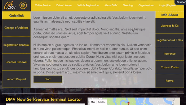
People come to the DMV websites for two main purposes: getting online services and finding useful information. Guiding by this idea, we designed two columns of tabs for the two main functionalities so users can find a quick start for each online service on the main page.
 |  |
|---|
VISUAL DESIGN
We add a DROP-DOWN MENU on the top to replace stacked text but also preserve function integrity. To make drop-down menu align with the grey box below, which means doesn't hide "Quicklink" and "Info About", "Home" was separated from the menu and moved to left side with an icon.
We use a dark background with bright button and text to highlight key points users need to focus on. The COLOR of button and menu changes when users hover and click on it.
To keep consistency, we use Helvetica FONT for body text and all the other clickable items and titles are in Avenir.
A MAP of different offices is added at the bottom to get a direct visual impression of the location.
The HEIGHT of two columns of tabs area (main body) is carefully designed so that if users open the website on a relatively small display (like 13-inch display or smaller), they could see the full part of columns of tabs area with a little part of the locator, which tells users "There's something more if you scroll down!"
When users scroll down, the drop-down menu would FREEZE on the top to provide a better usability.

bottom of page